
In this article, you will learn to create a Bar chart.
Introduction:
Let's understand this with an example.
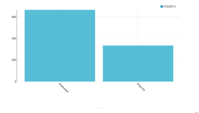
Let's learn how to display the number of students by Status - Graduated or Dropped out.
Step 1. In Impact Cloud Dashboard, to create a chart, click on the Chart tab from the Home screen. You can alternatively click on the + symbol to open the Chart submenu and click on Chart to create one.

Step 2. For this example, select the following
Dataset : Scholarship data
Note: It is physical dataset .
Popular charts or All Charts: Bar Chart
Finally, click on Create New Chart at the bottom right-hand side.
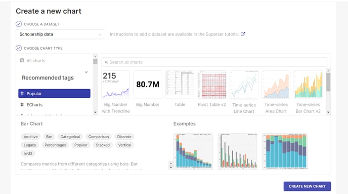
NOTE: It is mandatory to select the dataset and chart type to create charts
Step 3. In this example, select the below:
Dimensions: Status
Metrics : COUNT(*) ( for counting the students in each Status).
Note: You may use other mathematical operations such as SUM, AVG by choosing a numeric field on the metric
Click on the Create Chart button.
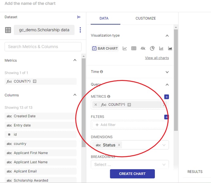
Remember: Selecting Dimensions and Metric is mandatory to create a Bar Chart
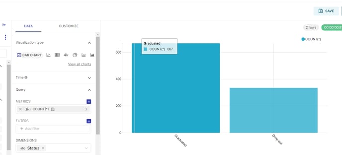
Step 4. The Bar chart visualization is created that shows the Status of Students who have graduated or Dropped out.
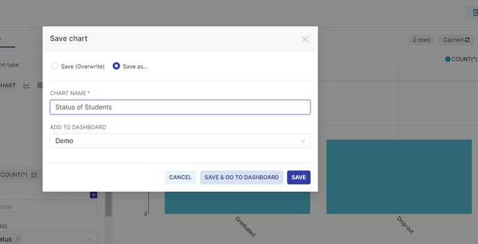
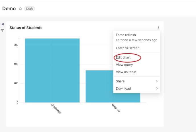
Step 5. Let's save the chart with the name "Status of Students" to the Dashboard named "Scholarship Demo" or any Dashboard that you have created.
Step 6. Your visualization using Bar Chart is created.
Let's learn about other visualizations in the next article.
LET'S PRACTICE
Step A: In this same visualization, let's learn the number of students by Gender in each Status.
Step B : Edit the chart as shown below :
In this example, select the below :
Dataset : Scholarship Data
Dimensions : Status
Breakdown : Gender
Metrics: Count(*)
Step C: Update the Chart.
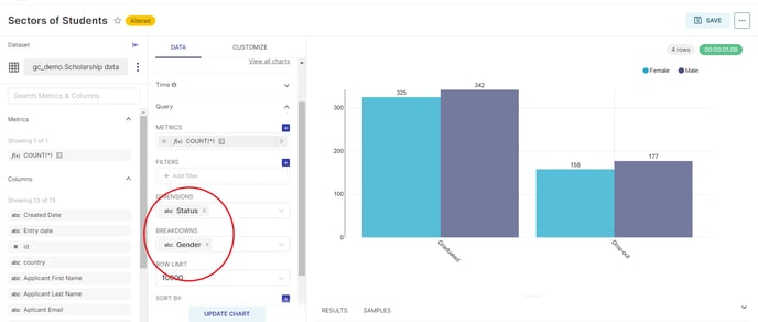
Step D: The above visualization should be displayed which shows the number of Students categorized on Status then by Gender.
Congrats !! You have learned to use Bar Chart.