
In this article, you will learn to create a pie chart.
Introduction:
The pie chart is a graphical representation of data that makes it possible to visualize the relationship between the parts and the whole of a variable. For example, it is possible to understand Gender participation in the workforce as a count or percentage of a variable level.
Let's understand this with an example.
Let's assume you need to understand the percentage of sector preferred by students.
Step 1. In Impact Cloud v3, to create a chart, click on the Chart tab from the Home screen. You can alternatively click on the + symbol to open the Chart submenu and click on Chart to create one.

Step 2. For this example, select the following
Dataset : Scholarship Data
Note: It is physical dataset .
Popular charts or All Charts: Pie
Finally, click on Create New Chart at the bottom right-hand side.
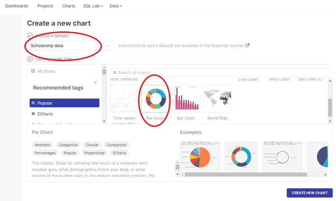
NOTE: It is mandatory to select the dataset and chart type to create charts
Step 3. In this example, select the below:
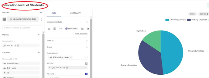
Dimensions: Education Level (You may alternatively select any column based on your use case.)
Metrics : COUNT(*) ( for counting the Education level of students who have applied for scholarship).
Note: You may use other mathematical operations such as SUM, AVG by choosing a numeric field on the metric
Click on the CREATE CHART button.
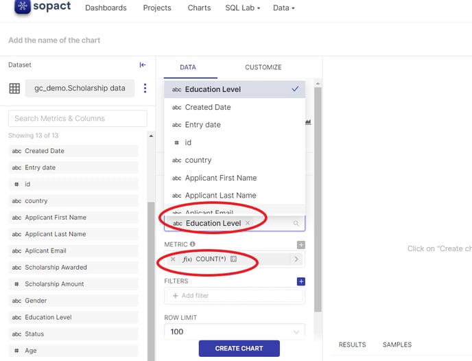
Remember: Selecting DIMENSIONS and Metric is mandatory to create a Pie Chart
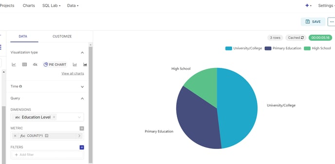
Step 4. The Pie chart visualization is created that shows the relationship using the column All sector using the virtual dataset .
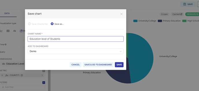
Step 5. Let's save the chart with the name "Education level students" to the Dashboard named "Demo" or any Dashboard that you have created.
Step 6. Your first visualization using Pie Chart is created.
Let's learn about other visualizations in the next article.
LET'S PRACTICE
Step A: Let's create another example of Pie-Chart to learn to use aggregation functions like SUM, AVG, MAX, MIN. For example, you want to understand the total scholarship Amount based on Education level.
Step B : Create a Pie-Chart using the above Step 1 & 2 using any data-set of your choice.
Step C: In this example, select the below :
Dataset : Scholarship data
Dimensions: Education level
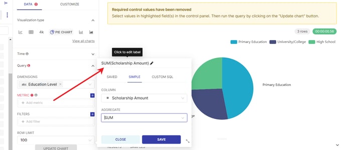
Metrics:
Column: Schoolarship Amount
Aggregate: SUM ( as you want to understand the total scholarship amount)
To do so Click on Metrics, it will open up the metrics dialog box as shown below :
NOTE: To calculate the SUM of scholarship amount based on Education Level. You will have to use Simple or Custom SQL.
Saved Metrics can also be used if you have already created customized metrics.
Use SIMPLE :
or USE Custom SQL ( If you are familiar with SQL)
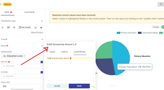
NOTE: While using SQL, the column name must be enclosed within double quotes(" ").
Visualization derived using Simple or USE SQL is the same.
NOTE: If the dataset is imported from Google sheets then all the columns or fields are stored as text. You will have to typecast it to perform any numeric calculations.
For example : SUM(("Scholarship Amount") ::FLOAT)
This typecasting will inform the SQL Editor that NumberofChildrenDependents contain a numeric value for performing operations.
But since the dataset is imported from Excel, it automatically adapts the specific datatype. There is no need to typecast.
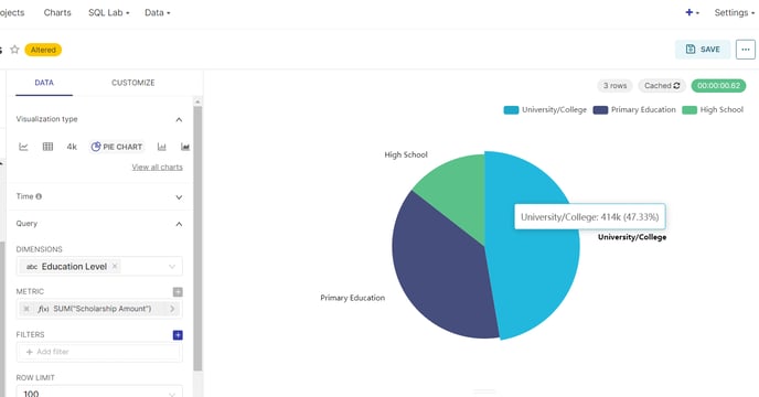
Step D: Save the metrics using either of the two methods and CREATE CHART or UPDATE CHART.
Step E: The following visualization should be displayed which shows total scholarship amount awarded based on Education level.
Similarly, use other functions with metrics :
for example
a) MAX to find the maximum scholarship amount awarded,
b) MIN to find the minimum scholarship amount awarded,
c) AVG to find the Average scholarship amount awarded.
STEP F: You can save the chart with a desired name and save it a dashboard of your choice.
Congrats !! You have learned to use other aggregate functions on metrics while creating a pie chart.